CSS3 has not been here for a long time, but talented designers have already found a lot of great ways to use it to create beautiful and efficient techniques. In this article, I'll show you the top 10 examples of what you can do using the power of CSS3.
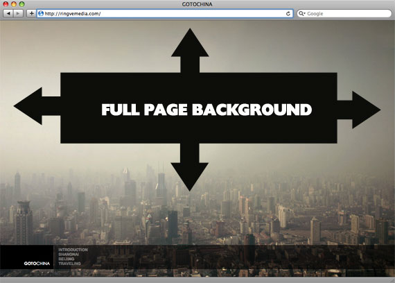
Perfect Full Page Background Image
We visited this concept of re-sizeable background images before… but reader Doug Shults sent me in a link that uses a really awesome technique that I think is better than any of the previous techniques.

Grid Accordion with jQuery
Accordions are a UI pattern where you click on a title (in a vertical stack of titles) and a panel of content reveals itself below. Typically, all other open panels close when the new one opens. They are a clever and engaging mechanism for packing a lot of information in a small space.
CSS Rounded Corners In All Browsers (With No Images)
n the past two years, increased browser support has transformed CSS3 from a fringe activity for Safari geeks to a viable option for enterprise level websites. While cross-browser support is often too weak for CSS3 to hold up a site’s main design, front-end developers commonly look to CSS3 solutions for progressive enhancement in their sites. For instance, a developer might add a drop-shadow in Firefox, Safari and Chrome using -moz-box-shadow and -webkit-box-shadow, and then be comfortable with this design enhancement falling off for IE users.
But wouldn’t it be great if IE users could see the better version of the page? Fortunately there are cross-browser hacks for the more common CSS3 attributes. These hacks not only allow CSS3 attributes to work in all browsers, but in turn allow designers and developers to use CSS3 in the central styling of their sites.
In this article we’ll walk through getting rounded corners working in all browsers. Firefox, Safari and Chrome are easy with the border-radius property, but we’ll have to jump through some extra hoops to get it working in IE and Opera.
After only a few compromises, we will have CSS rounded corners working in all browsers, and without using any images. Welcome to the ‘No Image UI Club’!
Read the entire article here; Jon Raasch’s Blog.
